Table of Contents
Last Updated on November 9, 2022
As any art lover knows, hanging paintings can be a tricky business. You want to be able to enjoy the artwork, but you also don’t want it to be a source of stress or anxiety. Posters prints and visual artwork can be a great way to express your personality and jazz up your home. But when it comes to hanging them, you may feel confused about making a start.
This blog will list nine tips for arranging artwork to transform your blank wall into an oasis of art.
9 tips on how to arrange your posters prints and visual artwork on a blank wall
For Single Artwork
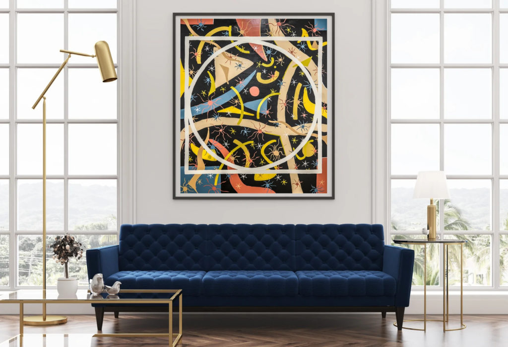
Blank walls are the bane of any home decorator’s existence. But there is one way to quickly make an empty wall look dramatic and impressive: single large artwork. If you opt for single-piece artwork, pay attention to the height. The average art hang is between 57 and 60 inches from the floor. When selecting a piece of art, you should also consider the surrounding furniture and wall space. If you have a large sofa, you’ll want to choose a piece that is proportional in size. Finally, don’t be afraid to experiment with different styles and genres of art. A single bold piece can make a significant impact in any room.
Symmetrical Hanging
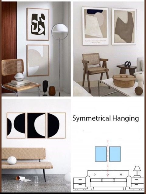
The symmetrical hanging style is excellent for artwork in the same size, shape, and theme. Aligning each piece next to itself with similar distances apart creates beautiful patterns when projected against each other as well. This will give you more space and ensure that each piece has its perfect column inches worth on display! Generally, a 2-3″ distance between each other works best; otherwise, they look inconsistently.
Asymmetrical Hanging
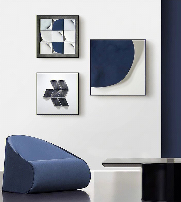
When you have different artwork but share some elements in color scheme or other elements, try staggering the pieces to add some interest to your artwork. This can add a sense of movement to your display and make it more eye-catching.
The Core line hanging method is a popular way to display paintings and other artwork. The center painting is the core, and the other pieces are hung around it, extending to the left, right, or up and down. This method is often used in art galleries and museums, as it allows for a focal point while still allowing viewers to see the entire collection. Core line hanging can also be used in homes, offices, or other spaces where a group of artwork is displayed. When using this method, it is important to consider the placement of each piece carefully, as the order in which they are arranged can impact the overall look of the display.
The Center Scattering Hanging for posters prints and visual artwork
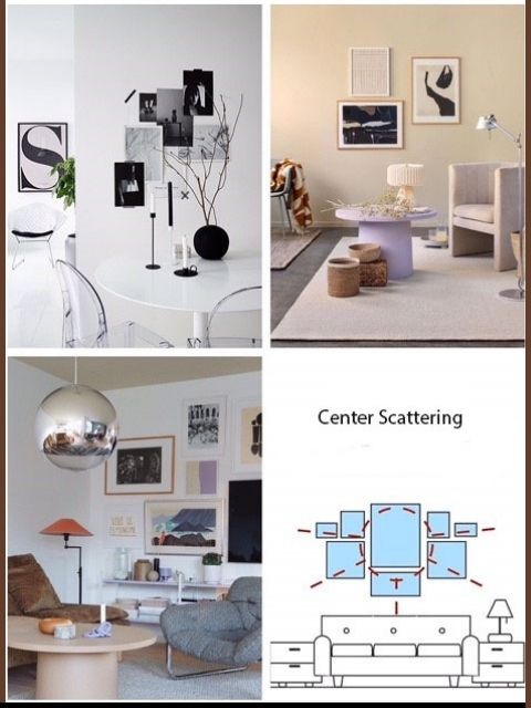
The center scattering hanging method is excellent for the personalization of your decor. By clearly defining a central point and extending paintings around it in a staggered fashion, you can create a look that is uniquely your own. This method works well with a variety of sizes and styles of paintings, and you can experiment with different combinations to find the perfect look for your space. However, it is important to pay attention to the overall color scheme and style of the paintings to create a cohesive look. Otherwise, the overall effect will be a bit chaotic and messy.
The Repeat Pattern

The Repeat Pattern is a great way to add visual interest to your home. This method involves hanging multiple paintings of the same size and color tone in a row or a column. This creates a textured look that is full of visual interest. This method is best suited for larger spaces, as it can dramatically impact the area around them.
Fill-in Layout
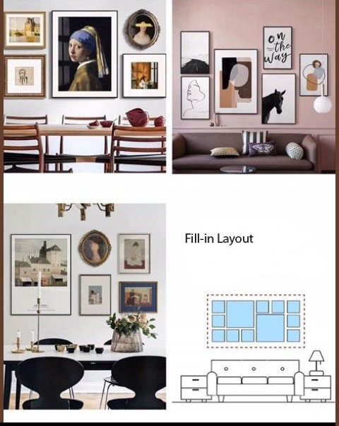
The fill-in Pattern is a great way to add a personal touch to your walls while still maintaining a coordinated look. To hang your paintings using this method, put different materials and styles of paintings within an imaginary frame and adjust the position of each decorative painting within the rims until you are happy with the overall arrangement. This hanging method is less formal than other methods, but it still allows you to create a stylish and cohesive display. Plus, it’s easy to change up the look of your Square Frame hanging by simply switching out some of the paintings. So if you’re looking for a way to add personality to your home décor, the Square Frame hanging method is worth considering.
Horizontal Line Pattern
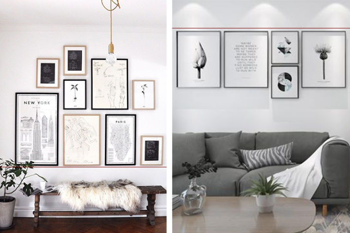
The Horizontal Line Pattern is a way of hanging different sizes of paintings together to look neat and orderly. The paintings are aligned either at the top or bottom, and the Horizontal Line is used as a guide to ensure that all the paintings are lined up correctly. This method is popular because it creates a sense of symmetry and order and can be used significantly in any room.
Display posters prints and visual artwork on shelves
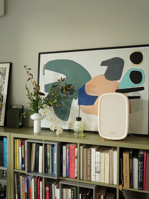
Shelves are a great way to show off your posters prints and visual artwork without worrying about hanging them. You can buy shelves specifically for this purpose, or you can repurpose an old bookshelf or other types of the shelving unit. Shelves allow you to change up the look of your display easily, and they’re also great for small spaces.
Staircase Hanging of posters prints and visual artwork
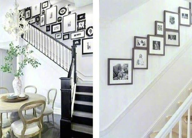
Hanging artwork on the staircase is challenging. In the meantime, the stairs are the perfect place to add artwork as it is easy to interact with viewers. When arranging the artwork in the staircase, be creative in the layout. Imagine all the individual pieces of art as a whole; you could try arranging the art in shapes other than the typical rectangular format. By being creative in your approach to staircase hanging, you will add interest and drama to your display.
It would help if you also considered when hanging artwork…
- Choose the Right Location:
When it comes to hanging posters, prints, and visual artwork, the location is vital. You want to pick a spot that is both aesthetically pleasing and practical. Take into account the natural light in the room, as well as the traffic flow. You don’t want your artwork hidden in a corner or obscured by furniture.
- Arrange the Artwork in a Grouping:
Too many visual artworks crammed into one space can be overwhelming, while too much empty wall space can make the room feel bare. Find a happy medium by grouping similar pieces or making a grid-like arrangement.
- Consider the size of your artwork:
Small pieces can be lost on a large wall, while large artwork overpowers a smaller space. Choose sizes that complement the wall and the other art in the room.
- Mix up the orientation of your posters prints and visual artwork :
Horizontal pieces can add visual interest to a room, while vertical artwork can make a space feel taller. Try different orientations to see what looks best in your room.
- Use artwork to create a focal point:
Hang artwork at eye level. This will ensure you can appreciate the art without straining your neck. If you’re hanging multiple pieces, vary the heights to add interest. As a rule of thumb, you should:
Keep the artwork’s center at your eye level or slightly lower,i.e., around 57″-60″ from the floor.
If you put the artwork above a piece of furniture, the bottom of the artwork should be 4-6 inches higher than the furniture and no more than 2/3 width of the furniture
Conclusion:
There are many different ways to hang posters prints and visual artwork. The best way to choose the proper method for your space is to experiment with other techniques and see what looks best. With a bit of planning, you can create a stylish and cohesive display that will transform your blank wall into an oasis of art.

