
Table of Contents
Last Updated on June 24, 2022
After all home-staging work is done, the next step naturally coming up is furnishing. Many people would embellish their homes on a whim, which resulted in unruly goods piled up together. Thus, we need to give a holistic plan for home furnishing projects. The Rule of thumb is to focus on the centerpiece, to integrate different colors scheme and patterns into the central theme you have set up. In this blog, I will focus on home furnishings’ most popular color schemes.
Color Scheme and Its Variants
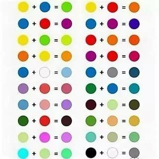
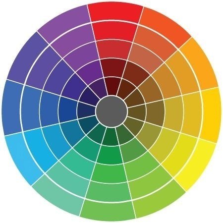
There are 12 colors on a color wheel, consisting of 3 primary, three secondaries, and six tertiary colors. However, the color wheel could be expanded to an infinite number of shades. Don’t worry about it; everyone can start with the basic color scheme.
Primary Colors: Red, Blue, and Yellow.
Secondary Colors: Orange, Purple, and Green. Combinations of the primary colors form each.
Tertiary Colors: Red-Orange, Yellow-Orange, Yellow-Green, Blue-Green, Blue-Violet, and Red-Violet, which are formed by mixing a primary with a secondary. Each is formed by mixing a primary color and secondary color.
And you should know and distinguish between tint, shade, and tone.
Tints: Lighting a color by adding white.
Shades: Darkening a color by adding black.
Tones: Slightly darkening a color by adding grey.
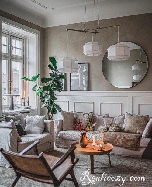
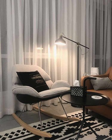
Neutral Color Schemes
Neutral colors include black, white, gray, tans, and browns. By adding brighter colors to the neutrals, you could get different shades of the same color.
In the context of interior design, neutral color means “without color,” but it always has undertones, such as white appearing slightly ivory or yellow. Because of its nature, this scheme gives ways to add various elements to space, like a canvas. Thus, using neutral colors as a background is for the dramatic accents. Upholstery, area rugs, and throws in darker shades against lighter backgrounds could bring visual pleasure from within.
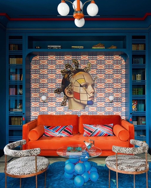
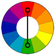
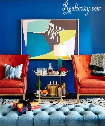
Complementary Color Schemes
Nowadays, a complementary color scheme is gaining its foot. The bold and contrasting effect claims the authority of vibrance and reflects the tinge of diversity in our times. Unlike what it appears, a complementary color scheme is simplest to apply. It uses two colors that sit opposite on the color wheel.
We always hold ourselves back when using contrasting colors. We follow the trajectories within the same spectrum while choosing colors. The trick to pleasing our visual sensation with contrasting colors is to use one color as a backdrop and an accent with small patterns.
Split-Complementary Color Schemes
The primary color is used in a split complementary color scheme with two analogous colors to complement it. Compared with the complementary color scheme, it reduces tensions. A split-complementary one could be an eclectic approach if opting for the complementary color scheme is too risky. It preserves the boldness and meantime, absorbs the calmness, and maintains the balance. It works best when your dominant color is lighter, and pick two bold colors in the accent pieces.
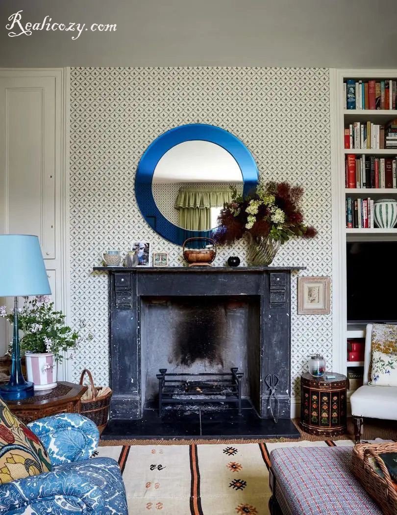
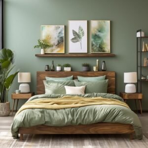
Monochromatic (Analogue) Color Scheme
An analogous color scheme refers to the color wheel’s three colors in a row. Typically, three colors are a set of one primary color, one secondary color, and a shade by mixing the first two colors. We could find this scheme in nature delightful to the eye. In a monochromatic color scheme, ensure that there are enough contrasts, i.e., accent elements, such as a noticeable antique, decorative throw pillows, or a piece of conceptual furniture that could easily stand out against the backdrop. In addition, the 60-30-10 Rule plays out to its best standing of proportions.
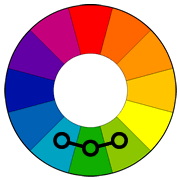
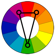
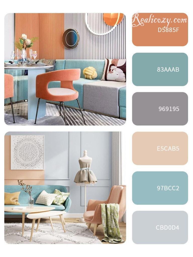
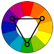
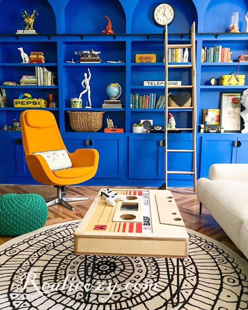
Triadic Color Scheme
A triadic color scheme uses evenly spaced colors on the color wheel. This color alignment tends to be quite vibrant, even with unsaturated hues. Hence it is primarily used in a space like a playroom. The trick to manipulating this color scheme is to balance using one dominant color and another two colors for accent.
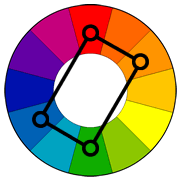
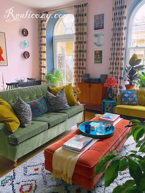
Tetradic (Rectangle) Color Scheme
A tetradic scheme involves four colors set into two complementary pairs. It also refers to a rectangle scheme because of the shape it appears on the color wheel. This scheme provides endless possibilities in color richness. Make the balance by choosing a pair of warm and cool colors to fill the space and avoid jarring.
Another trick to let this scheme work best is to use a few patterns to fall within the same color spectrum. Few patterns will help the eye rest by breaking up space, mainly when solid colors are in place.
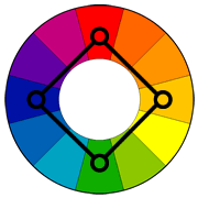
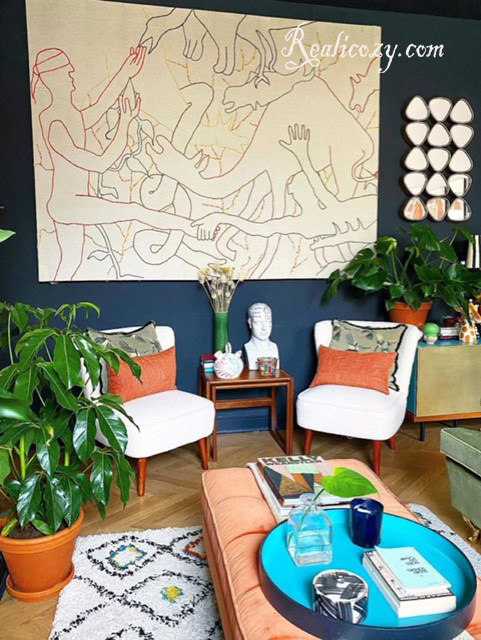
Square Color Scheme
The square color scheme is similar to the rectangle but with all four colors spaced evenly around the color wheel. It mainly uses four shades instead of focusing on the opposing pairs. Two shades are neutral, and another two are a little bolder. Adjust the saturation of the shades and pay attention to the balance between the warm and cool colors. This scheme works best if you let one shade be dominant and the other three be accents.
Rules of Applying Color Scheme
The Rule of 60-30-10
It is a classic home decor rule. The 60% color is often dominated by the wall, large pieces of furniture, and floor-covering. The 30% secondary color goes to the Accent furniture, window treatment, and other sizeable tapestries. And the rest 10% lies in artworks, soft decorative furnishings, throw pillows, and small decorative accessories.
Beyond the Rule of 60-30-10
Generally, the Rule of 60-30-10 works best in the monochromatic color scheme. If you desire a bolder design, you may go beyond this Rule by adding shades of a fourth color. And accent furniture, patterned throw pillows, and other items of decorative nature will come into play.
Conclusion
Colors have a temperature that can dramatically affect moods, feelings, and emotions. Cool colors give a calm and serene home, while warm colors give a rich and intimate experience. Well-balanced color schemes could not only bring us visual pleasure but also influence our behavior and reaction subconsciously. Therefore, to further boost our well-being.
Besides, keep in mind that we shouldn’t compromise functionality while in pursuit of aesthetic pleasure. Proper lighting, ergonomic chairs, and eco-friendly upholstery are parts of the process. Only do the enticing colors come along with these items; a healthy lifestyle completes.
Aesthetics, in addition to Comfort, achieves the ultimate goal of your home project!
.


3 thoughts on “The Most Popular Color Schemes in Home Furnishings”
Hi there! I know this is kind of off topic but I was wondering which blog platform are you using for this website? I’m getting fed up of WordPress because I’ve had issues with hackers and I’m looking at options for another platform. I would be great if you could point me in the direction of a good platform.
Thanks , I have just been looking for information about this topic for a while and yours is the greatest I have discovered till now. But, what about the conclusion? Are you certain about the source?
The conclusion is that the color scheme depends on the design style you choose. A Minimalist style may opt for a ” Neutral Colors Scheme”, while a Maximalist style is better for a “Complementary Color Scheme”.